Tide's overview

Tide’s overview #
The things that I did which unfortunatly didn’t make the cut for a case-study but surely improved the workflow of Tide’s Design System. As a senior I worked on some of the broder topics to improve the overall processess
- Collaboration and developer handoff
- Component design and standards
- Design System Support
- Documentation and communication
Collaboration and developer handoff #
Current situation #
🌉 Design-to-Development Handoff (Initial State)
Upon joining, the organization lacked a formalized developer handoff protocol or dedicated documentation system. This critical process was entirely managed through ad-hoc calls and meetings, which resulted in the following operational inefficiencies:
Information Degradation: Reliance on verbal communication and impromptu discussions increased the risk of information loss or misinterpretation between design and engineering teams.
Operational Friction: The absence of a single source of truth necessitated frequent, unscheduled clarification meetings, consuming valuable time from both design and development resources.
Reduced Velocity: The disorganized handoff process directly contributed to an overall increase in development Turnaround Time (TAT), hindering product velocity and deployment schedules.
Updated solution #
✨ Immediate Initiatives and Process Improvements
- Spearheaded the adoption of a technical specification tool by submitting a formal request for a Figma plugin within the first week, strategically simplifying the documentation process for engineering teams.
- Significantly accelerated the speed-to-market for new features, enabling teams to ship releases in days instead of weeks by providing standardized, clear specifications.
- Reduced design and development costs by minimizing rework and duplication across cross-functional teams, directly impacting project efficiency and turnaround time (TAT).
- Established a single source of truth by embedding all necessary technical documentation directly within the Figma files, effectively eliminating miscommunication between design and engineering.
- Streamlined the query resolution process by shifting developer support from public group channels to direct, 1:1 communication, ensuring faster and more focused issue resolution.
- Proactively introduced developer notes directly onto design files wherever complex interactions or specific technical requirements were necessary, enhancing clarity during implementation.
- Instituted early and continuous developer involvement in the design process to solicit real-time technical feedback, ensuring design feasibility and reducing late-stage rework.
Component design and standards #
At joining, I wasn’t able to find any quiddines regained when a component is modified or added to the design system
Current situation #
🚧 Initial State and Challenges
Design Workflow & Governance: The design team lacked awareness regarding the process and feasibility of creating “local” or project-specific components, resulting in all new components being immediately pushed to the central Design System library without proper vetting.
Component Usage: In the absence of established sharing protocols, designers frequently resorted to inefficient methods like copy-pasting components between files, hindering updates and propagating inconsistencies.
Tokenization Debt: A complete absence of a formal design token system resulted in manual value management and a direct link between design attributes and code, increasing maintenance costs.
Color Palette Chaos: The entire color palette was unrestricted and available for any use case, leading to widespread inconsistency and visual noise across the application interface.
Lack of Structure: There was no systematic categorization or organization of colors (e.g., semantic versus utility), making color selection arbitrary and prone to error.
Component Modularity: Components were architected for highly specific, singular use cases rather than designed for generalizability and flexibility, leading to component sprawl.
Technical Debt (Legacy System): Components were built upon outdated or legacy features of the design tool (Figma), significantly increasing the technical effort required for system updates and maintenance.
Missing Documentation: Comprehensive documentation was absent for critical component properties, including:
- Defined states (e.g., active, hover, disabled).
- Clear usage guidelines (when to use, when not to use).
- Component types and variations.
Updated solution #
🎨 Design System Implementation & Architecture
- Established a scalable and hierarchical design token architecture, incorporating base, semantic, and component-specific token levels to ensure consistency and modularity.
- Streamlined the design tokenization pipeline to effectively mitigate value leakage between the design and development workflows, ensuring design intent is accurately translated into code.
- Categorized and scoped the color palette based on specific use cases (e.g., limiting colors for text usage), which significantly enhanced visual consistency across the application.
📈 Consistency & Quality Improvement
- Achieved a 100% improvement in critical visual consistency metrics (e.g., Text, Background, Borders, Icons colors) across the application within one quarter by implementing a structured token system.
- Developed and documented comprehensive design guidelines outlining best practices and key considerations for component creation and maintenance.
🤝 Collaboration & Enablement
- Conducted internal demonstrations and training sessions for the team upon the release of new components to ensure proper adoption and usage.
- Increased designer participation in our bi-weekly Design System “drop hour (to ask or clarify doubts about DS)” by 15%, fostering better collaboration and contribution to the system.
Design System Support #
Current situation #
📢 Challenges with Unstructured Support Channels
Reliance on a high-volume, common communication channel (e.g., Slack) for formal support requests, questions, and doubts resulted in significant governance and operational issues:
Lack of Traceability: The channel provided no mechanism for formal tracking or logging of incoming requests, making it impossible to audit past queries or measure support volume.
Absence of Accountability: The system inhibited the ability to formally follow up on or assign ownership for reported issues, leading to unresolved items.
Information Siloing: Critical support requests were easily misplaced or lost within the high message volume of a large group (170+ members), preventing timely attention.
Resource Management: The process lacked the necessary structure to time-bound or prioritize tasks, negatively impacting workload management and service level agreements (SLAs).
Poor Resolution Visibility: There was no centralized visibility or communication channel to broadcast resolutions or frequently asked questions, resulting in recurring queries.
Systemic Deficit: The absence of a formal system meant no automated ticket creation occurred, hindering process maturity and metric collection.
Updated solution #
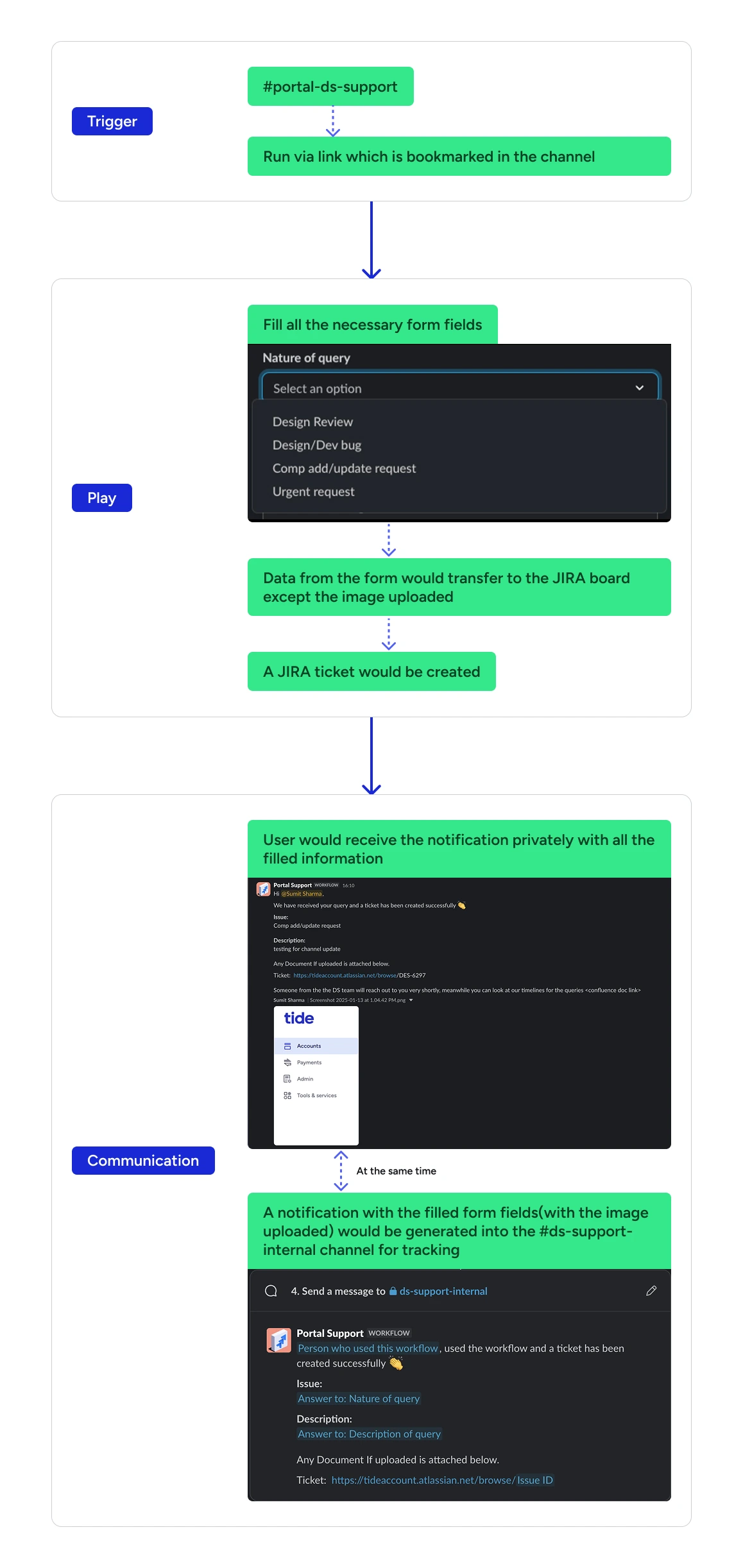
Focusing on Automation and Integration
Automated the Design System (DS) support process by developing and implementing a custom Slackbot that captures support queries via a standardized Graphical User Interface (GUI) form, integrating it seamlessly with Jira to automatically create and track formal support tickets.
Documentation and communication #
📚 Design System Documentation Overhaul
Initial State (The Challenge)
Documentation Deficiencies: The existing component documentation was severely deficient, characterized by outdated information and the complete absence of critical usage guidance.
Missing Core Content: Key instructional elements such as usage guidelines (when to use, when not to use), definitions of component types/states, and detailed component anatomy were not formally documented.
Strategic Intervention (The Solution)
Established Technical Documentation: I formally introduced and mandated technical documentation for the first time within the Design System workflow, ensuring engineering-ready specifications.
Leveraged Automation for Specs: Integrated the use of the Figma “Specs” plugin to automatically generate and embed comprehensive technical specifications, including:
Detailed Component Anatomy.
Visual Spacing Maps (measurement details).
A clear Properties Overview.
Standardized Component Page Structure: The component documentation pages were comprehensively updated to align with best practices, featuring:
The component itself with clear, descriptive labeling.
Clear labeling of nested components (designating them as local components for DS design use).
Ready-made examples showcasing the component’s implementation in real-world design scenarios.
Integrated technical specifications.
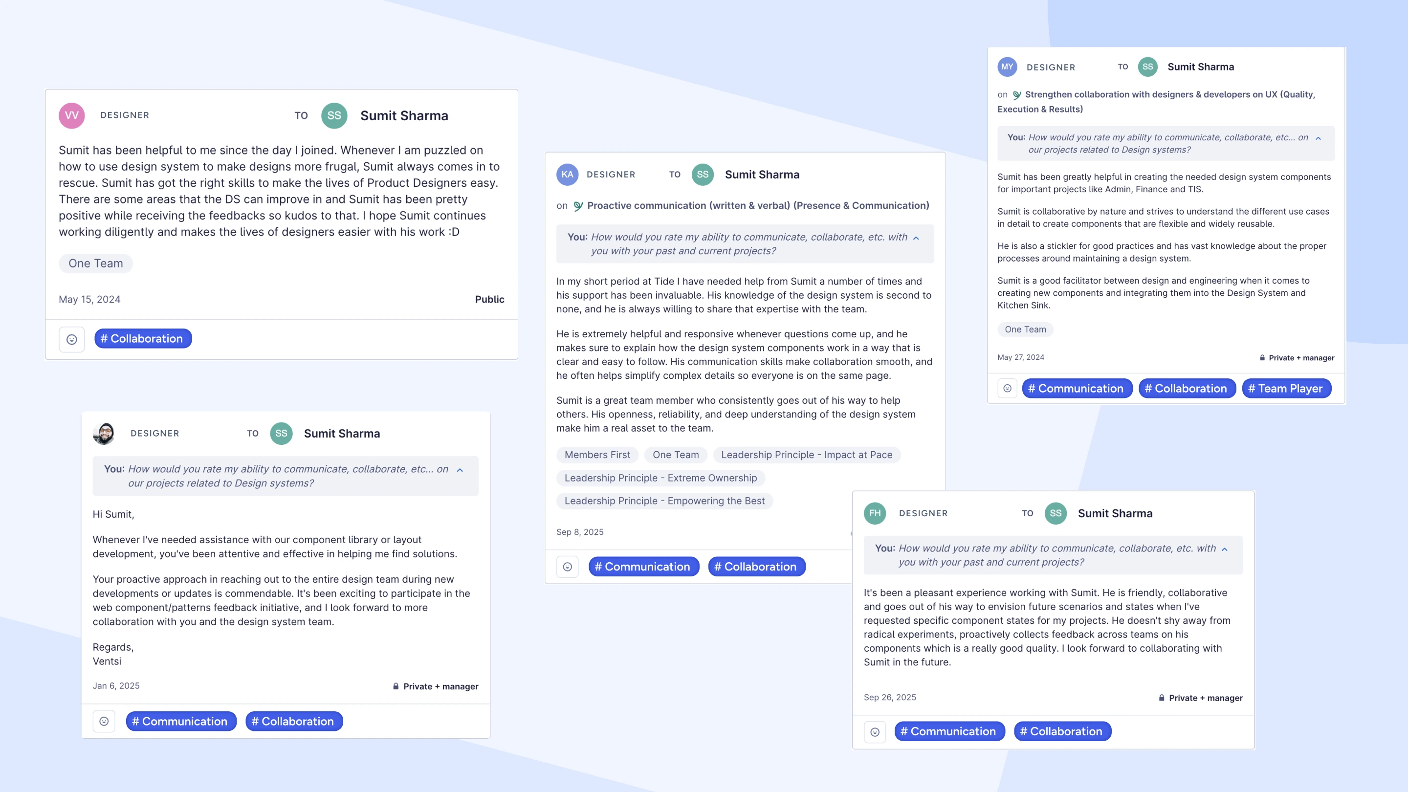
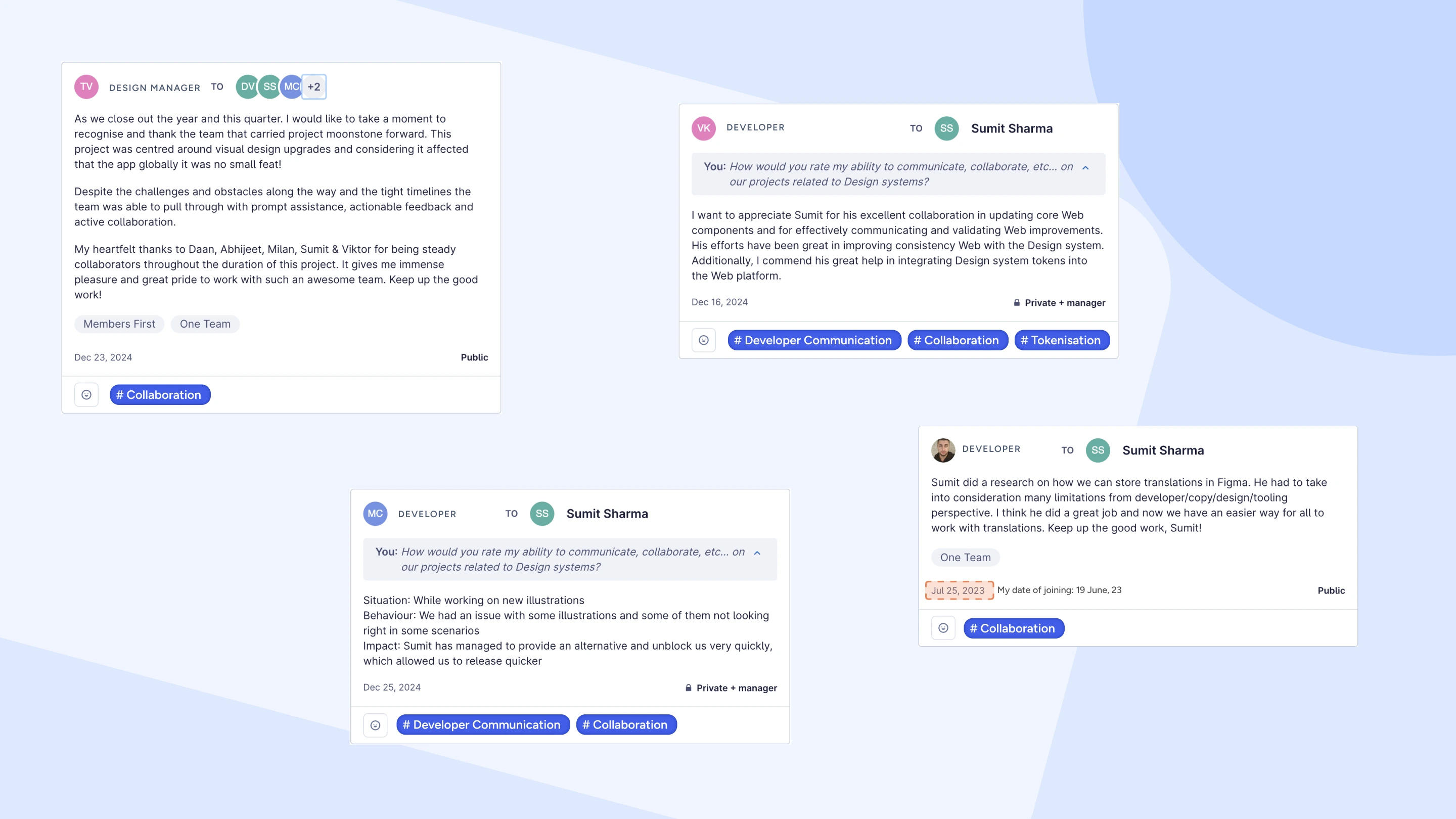
Appraises #